Pages

Wednesday, October 3, 2007

The Beauty of Signage

For the new limited-release of the Marshalls Beauty shop, I was tasked to write a signage package describing categories within the shop in the "Shop On" campaign voice. Tons of fun and pieces I'm pretty proud of. Take a little look-see:

Saturday, September 8, 2007

Gotta Love the Cube

And I do. But my fondness for the department is soooooo (* quintessential teen/young adult speak. It takes a little bit of practice.) outweighed by my adoration for the microsite.

Here are a couple of shots from the site, www.marshallscube.com

(Design by Sara Rubinow)


Fall Web Madness!

Mm, okay, maybe not madness. More like, say, fall web refresh. Here are some screen grabs of our ladies', men's and home department pages.

(Design by Sara Rubinow, Michelle Carlson and Emily Taylor)
(And thanks to Pope Carlos for teaching me the joys of the apple-shift-4 screen grab image selection.)

What's More Terrifying Than Halloween?

Paying too much for your costume.

Or, at least, that's what we on the Marshalls creative team would like you to believe. Here's a look at one of my favorite iterations of this year's Halloween DM. It changed to a different look and feel as the direction from brand changed, but this was some copy I was sad to see go - especially the Halloween 2007 tag line on the back.

(Design by Pope Carlos)


Huzzah for New Campaigns!

Oh Marshalls Laws, I hardly knew ye...would be a lie. I knew you only too well. I've know the agony of fitting in an event message, a savings message and a cute little quip into eight words or less. Again and again and again. You paid my bills for a long time, but there's a new game in town and we're giving you the boot.

Enter the "Shop On" campaign (as created by Mullen Advertising). It's an empowered yet playful call to shoppers of the world, encouraging them to revel in the delight of shopping and celebrate the spectacular savings at Marshalls.

To that end, here are some pages from our Men's Fall DM. It's actually much longer than this, but I've pulled out some of my favorite lines. The piece is aimed at women who need to shop for fall clothes for their husbands, boyfriends or sons. (Or all three. I'm not here to judge.) Take a little peak and don't miss the first line of the last page. A personal favorite that went over big with the brand, as well.
(Design by Pope Carlos)


Friday, June 8, 2007

Fall Fashion by Way of the British Isles

One of our concepts for the fall package this year involved shooting in London and infusing British elements into the designs for institutional signage, web, direct mail, newspaper, consumer print and tv.

Alas, said campaign was not chosen, but here are a couple of signage elements for your viewing pleasure:


(Designs by Pope Carlos)

Thursday, May 24, 2007

SXSW Interactive Conference

Unfortunately, I was unable to attend this year, but I have to recommend wading through the podcasts at http://2007.sxsw.com/coverage/podcasts/ There's some excellent information up there about many of the new innovations available for advertising and marketing (see the social media and mobile podcasts) as well as the challenges they encompass (check out bridging the cultural devide.) I definitely mean to head out there next year.

Much thanks to friend and colleague Sara Rubinow, who presented an intriguing summary.

Wednesday, May 23, 2007

Summertime Shopping Enticement

So, here in the retail world, we live many months into the future. You are living mid-spring and we are living back to school and fall. "What's happening in the future," you ask? Tunics again. And cures for all debilitating diseases.


I'll return for a moment, though, to your time and share with you a few pages of the oh-so-lovely summer direct mail piece, as designed by the talented Miss Melody Olbrych. Bask in the glow and then give in to the urge to buy sandals. (Digression: have you actually been in to a Marshalls Shoe MegaShop, speaking of sandals? Divine. And this is coming from someone who usually has a hard time with the whole "joy of the hunt" paradigm.) Without further ado:

Monday, May 21, 2007

The Ad Age Creativity Awards

Was my work cited as one of the 17 most brilliantly creative projects in any medium this year? Sadly, no. However, this was, after all, the first-ever incarnation of the Creativity Awards so they can't be expected to have gotten everything right.

Among other things they didn't get right: leaving the open bar open while attempting to give out the awards and facilitating a Q&A. Otherwise, though, it was relatively thought-provoking evening. The big grand-prize winner was part of the Dove campaign and featured a real woman being made up and then photoshopped until she looked like a supermodel; which is a good and valid message for the women of the world and an ironic one for the advertisers, considering making things and people look preternaturally appealing is part of what we do. But I won't tell the American public if you don't.

Rounding out the rest were, without getting too specific, a video for a primarily-fashion brand that featured nil fashion and tons of politics plus a tv spot for a car that focused on the sounds the car makes. Despite the fact that I liked both for the entertainment value, I have to stop and ask the question "Is entertainment enough?" Is a brand ever so well branded that its advertising can mostly eschew an important message about the product in favor of entertainment or oddity?

Here's what I'm thinking: no. No matter what your product may be, you've got something to say about it. If your message is that your product weird or edgy, maybe we have a different verdict. Otherwise, weird or edgy or entertaining just for the sake of being "different" is a waste of advertising dollars when you could be finding a way to communicate a message in an equally compelling manner. Even product placement in movies conveys a branding story about the product.

So, in summation, strategy uber alles. I like a little message-minded reasoning behind my advertising. I'm just saying.

Friday, May 11, 2007

Shoe Strategy

Here's a little concept I'm particularly proud of because it hit what our brand was looking for spot-on. One of the designers (Melody - it's often Melody. She's an insanely good partner for both concepting and design) and I were challenged to come up with a way to convey the key points of the Marshalls Shoe MegaShops (name not our doing) to frequent and infrequent customers. The crux of the Shoe MegaShop is that it is a much larger selection of family shoes in a layout that lets people shop by shoe and not by size. This direct mail piece was being sent to announce that the already-existing Marshalls in their area had just opened this new department.

And so, without further ado, the middle panel of copy from our "Stepped Up/Step In" concept:


(Design by: Anthony Shea and Melody Olbrych)

Thoughts on Directing Talent...

...or, Why Playing Shelby in a High School Production of Steel Magnolias Significantly Aided My Career


Having just listened to the final cut of the newest Marshalls CUBE radio spot with some senior management (rave reviews, thank you), they were struck by how the seemingly small changes in wording and intonation-directing that I made as we were recording enhanced my original script. And, actually, I got the same kind of pleasantly surprised reaction when I was working on a video series for Indiana University a few years ago. Change a few words, suggest a different emphasis and messages change dramatically.

So, of course, I smile humbly while giving myself a big old internal round of applause for putting in some quality time with the drama kids in high school. Because, what it comes down to is that you can’t write copy without inhabiting the personality of the voice. Some campaigns and companies definitely have more personality to their copy than others, but in order to write it, you’ve got to have a good understanding of that voice behind the copy -- just the same way you have to understand the character behind the lines in a play. And then, once you understand that character/personality/voice, you can make changes (or direct people to make changes) in ways that are true to that personality and message. So, I guess what it all comes down to is that I owe a certain portion of my skills as a copywriter to weeks of studying Ibsen in class and rehearsing Shelby on stage.

This also may mean I should have been less of a pain in the ass in class. Well, live and learn.

A little more about concepting...

Here was another little challenge. One of the designers and I were tasked to come up with a newspaper ad to call attention to the summer shoe selection without the benefit of an actual event. Read: make our standard institutional message compelling. And I think we did.

Here are our three concepts (designs by Melody Olbrych):

A little about concepting...

So here's a challenge I face at Marshalls on a regular basis: we're not able to mention the names of the designers or the stores from which we obtain our merchandise. They're big designers and high-end stores, but must remain nameless, nonetheless.

Here are a couple concepts one of the designers and I came up with to allude to "that high-end New York department store" without actually using the name. (Note: the Manhattan versus Lexington ave. versions depend on where the ad ran. Lexington Ave. would run in the New York market and Manhattan would run in Boston.)


(Designs by Melody Olbrych)

Thursday, May 10, 2007

Marshalls Laws


Oh, Marshalls Laws, you've been my bread and butter for quite a while now. Since the laws I've written number in the several hundreds, let's look at a few of the favorites:


Marshalls Law #145

Find faux flowers for peonies on the dollar


Marshalls Law #34

Get gifts for dad at just a few bucks a pop


Marshalls Law #54

Shop for cropped pants without coming up short.


Every single law had to incorporate fashion and savings in less than 10 or so words. Again, I've written hundreds. That's commitment, baby.

(Above design by Sid Lee and Melody Olbrych)

Men's Trend Report


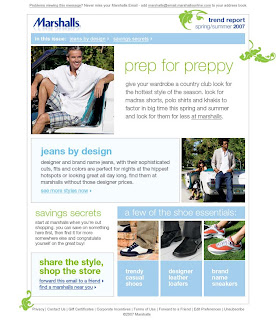
"What?" you say, "are there really fashion trends for men?" Just barely. Through the magic of copy, watch me create an entire Men's Trend Report based on madras and polos.

(Design by Michelle Carlson)

Marshalls Fashion Police Microsite

These Marshalls Fashion Police don't mess around. Just how tough are they? Well, judge for yourself at http://www.marshallsfashionpolice.com/. It's all a public relations tie-in to the Marshalls Law concept and, of course, it's all my copy.
(Design by Sara Rubinow)

Marshalls Holiday Home Press Kit


Ah, the retail press kit. An opportunity for the writer to get a little fun and funky in an effort to entice the editor to learn more. Take a moment to view the joyousness of the Marshalls Home Holiday Press Kit 2006. Did I mention that the copy is much more readable at http://www.creativehotlist.com/nkrawczyk ?

(Design by Sid Lee)


Karmaloop.com

So, for a bit of time, I did a stint as a freelance copywriter for Karmaloop.com (now also located in a brick and mortar store on Newbury St.) . The assignment was to make the descriptions as out of the box as possible while still making the fashions, you know, desirable. Here are a couple of my favorites:

(Again, sans pictures. You'll see the real thing in person. Be patient.)

Bianca Top
Dojo? Oh no! Just because you can chop blocks of cement into two doesn’t mean you have to wear a dowdy karate uniform. We’ve cut off the sleeves and shoulder, but kept the sash (with decorative stitching, no less!) to give you a functional tube top: vanquish your enemies during the day, be the belle of the Sushi Social at night.
Bianca top by Kitchen Orange has a wide upper band. 62% cotton, 33% nylon, 5% spandex.
Original: $62.00Sale: $43.4030% Savings

Working Girl Pant
Whether you're CEO or on the assembly line, there is one great equalizer throughout women-dom: a great pair of chino cargo pants. (Well, there might be a couple others, but chinos are awfully important.) Here's a cut that looks good on absolutely everyone - just a little baggy with a slight flare. After 6 o'clock, we're all just women, right? Don't we all just want to look fabulous? That's right, it's clothing for the people by UFO.
Light weight micro twill pant has fixed waist, cargo pockets with velcro closures and knee pleats. 31" inseam.$52.00 Click for Currency Converter

Tropic Pant
We're jealous. We wish we could be like you and drop everything to move to St. Lucia. Who knew you could make a living foraging for seashells during the day and making daiquiris at night? Luckily, the one pair of pants that you packed is versatile enough for both. They're cropped with drawstrings at the waist and cuffs, and buttons run up the outside seams for when you need to roll them up to wade deeper into the balmy blue. The striped waistband draws eyes to your perfectly tanned middle. So...do you think there's room in your beach hut for a few more people? 19 1/2" inseam.$62.00 Click for Currency Converter

Hamilton Sundstrand Aerospace

Well, my most recent experience may mostly involve fashion, but never let it be said that I can't romance the hell out of an Added Value Program for an exceedingly large aerospace company.

Here are a few pages from the 71 page brochure. You've gotta love translating technical-speak into good, clean marketing writing to love working with engineers.

Take a look at that propeller systems page (there were 40+ more pages like that.) I used to actually know what all that stuff meant!