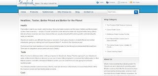
I had the privilege of working with the fine people at Stonybrook Water to help them rewrite their website. Now, it's a whole lot clearer — much like their water.
Here are a few screenshots; you can check out the entire site here.
Showing posts with label content strategy. Show all posts
Showing posts with label content strategy. Show all posts
Monday, October 4, 2010
Clean Water For All!
Wednesday, May 5, 2010
Taking My Cue From a New Website
I've recently had the pleasure of beginning work with Lisa Quackenbush, owner of cuePR. Her dynamic, multi-faceted PR and marketing firm specializes in the design and architecture fields, which, frankly, makes it all the more fun for me! As the first of what I hope will be many projects together, we've created her website.
Designs by Trish Lafleur
Designs by Trish Lafleur
Thursday, March 25, 2010
Let's Get a Little Poggled
This past winter, I had the pleasure of helping the creators of a new community site restructure the user experience, revamp the copy and refine the content strategy from head to toe (so to speak). The purpose of Poggled.com is to give people an opportunity to get customized bar recommendations, get the inside deal on drink specials at bars they like and bars they would like, and hook up with their friends to head out on the town. Fun, huh?
Below are some shots of the [non-member/non-signed-in] landing page and a few frames from the sign-up process. Cheers!
Below are some shots of the [non-member/non-signed-in] landing page and a few frames from the sign-up process. Cheers!
Monday, February 22, 2010
A Pluck-y Community Integration
When SmarterTravel.com decided they wanted to add a community platform to their sited, they used structure and templates from a company called Pluck. When they wanted those implemented, designed and written for, they used the product team, Kate Orchard (the designer) and myself. Sans an Information Archictect, this involved a great deal of content strategy, not to mention a great deal of fun.
Here are a few select images from the flow. As you can imagine, there are certainly a ton more.
Here are a few select images from the flow. As you can imagine, there are certainly a ton more.
Labels:
content strategy,
interactive,
Smarter Travel,
social media
Redesigning a Pup's Domain
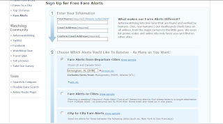
The goal redesign of Airfarewatchdog.com was to make the site more user-friendly and intuitive for the would-be traveler. This involved restructuring pages, restructuring use case paths and working with a pretty cute dog illustration. It's tough being me.
Designs by Michelle Carlson and Justin Henry.
Designs by Michelle Carlson and Justin Henry.
Labels:
Airfarewatchdog,
content strategy,
interactive,
redesign
Saturday, March 15, 2008
Introducing adidas miCoach!
My current gig at Molecular as copywriter and content strategist has given me the fabulously fun opportunity to work on the adidas miCoach site, the web console for a revolutionary new personalized coaching system. It's big in Europe. Well, okay, right now it's only available in Europe. But it's coming...oh, it's coming!
Read a bit more about it on my content strategy blog, check out the site itself or take a quick peek at the screen shot below. Niiice.

Read a bit more about it on my content strategy blog, check out the site itself or take a quick peek at the screen shot below. Niiice.

Labels:
adidas,
content strategy,
interactive,
Molecular,
retail
Saturday, February 23, 2008
What's In? Why, Social Media is What's In!
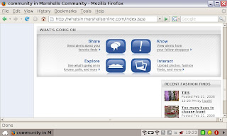
Ah, yes. The long-awaited launch of the Marshalls/T.J.Maxx social media communities has occurred. What's In is set to take retail by storm!
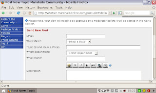
Here's a little back story for you: a brilliant idea was hatched to create a social media site wherein Marshalls and T.J.Maxx customers could go into the store, spot a too-good-to-be-true find from a fabulous designer, take a picture of it with their cell phone and then upload it to the site to let fellow community members know that there's a fabulous [insert designer] [insert product] at the [insert city] Marshalls store! Plus, of course, members can create an online profile, post pictures of their favorite finds and ask and answer questions in forums.
How did this all come about, you ask? Frickin' hard work. Luckily for me, our dedicated team was very, very small. Luckily? Yes: I got to be intimately involved in everything from creating the site architecture to crafting all of the messaging. You know what, kids? Content strategy is tons of fun.
Here are a few screen shots from the site. (You can poke around it yourself at www.marshallsonline.com/whatsin )
Labels:
content strategy,
interactive,
Marshalls,
social media
Subscribe to:
Posts (Atom)

