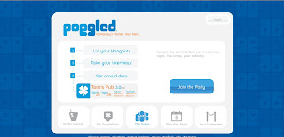
Below are some shots of the [non-member/non-signed-in] landing page and a few frames from the sign-up process. Cheers!
Thursday, March 25, 2010
Let's Get a Little Poggled
This past winter, I had the pleasure of helping the creators of a new community site restructure the user experience, revamp the copy and refine the content strategy from head to toe (so to speak). The purpose of Poggled.com is to give people an opportunity to get customized bar recommendations, get the inside deal on drink specials at bars they like and bars they would like, and hook up with their friends to head out on the town. Fun, huh?
Below are some shots of the [non-member/non-signed-in] landing page and a few frames from the sign-up process. Cheers!
Below are some shots of the [non-member/non-signed-in] landing page and a few frames from the sign-up process. Cheers!
Subscribe to:
Post Comments (Atom)


No comments:
Post a Comment